Australian brands are rethinking how their products appear on shelves, and the shift is unmistakable. Design choices that felt safe or predictable a few years ago are being replaced with bolder statements and more intentional material selections. What’s driving this change isn’t just aesthetics. It’s about standing out in crowded markets where every millimetre of packaging real estate counts.
The rise of label printing services that offer quick turnarounds and flexible options has made it easier for businesses to experiment with fresh looks without committing to massive print runs. Brands can now test seasonal designs, refresh their identity more frequently, or launch limited editions that create buzz. This accessibility is reshaping what’s possible for small to medium enterprises across food, beverage, cosmetics, and healthcare sectors.
Less Is More (But Only When Done Right)
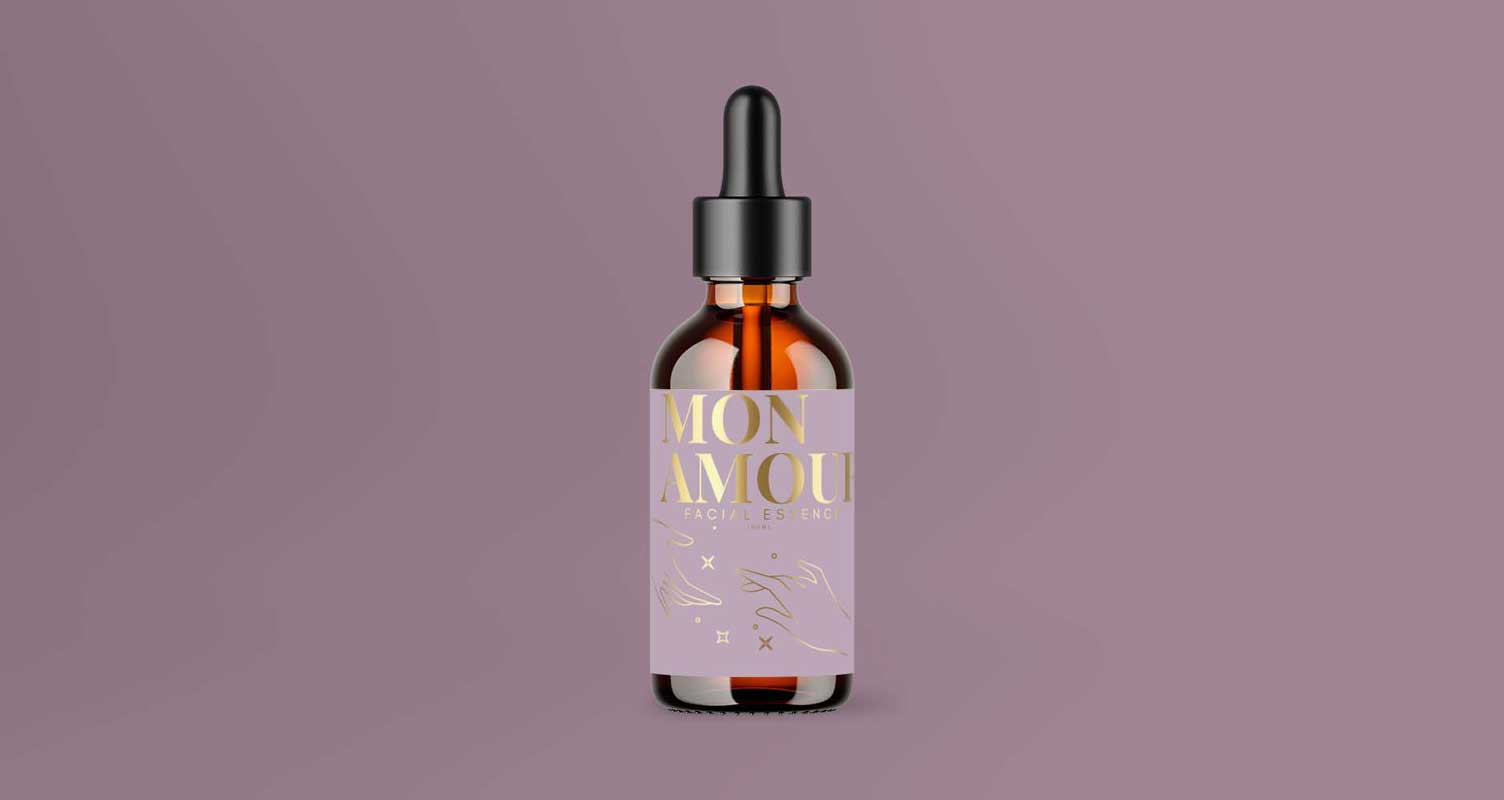
Clean Lines and Negative Space: Minimalist labels continue to hold their ground, particularly among premium brands that want to convey sophistication without shouting. Think muted colour palettes, generous white space, and typography that does the heavy lifting. This approach works brilliantly for artisan products, organic ranges, and luxury cosmetics where simplicity signals quality and restraint.
Strategic Use of Colour: Minimalist doesn’t mean colourless, and thank goodness for that. Many Australian brands are opting for single accent colours against neutral backgrounds, creating labels that feel modern and intentional. This technique works especially well when the accent colour ties directly to the product inside, whether it’s the deep amber of craft beer or the soft pink of rose-infused skincare.
Go Bold or Go Home: Maximalist Labels Are Back
Typography That Screams for Attention: At the opposite end of the spectrum, maximalist labels are having their moment, and we’re here for it. We’re seeing oversized text, layered graphics, and colour combinations that demand attention. This trend resonates particularly well with younger consumers who appreciate brands that aren’t afraid to take creative risks and express personality through design.
Metallic Accents Without Breaking the Bank: The demand for metallic finishes has grown significantly, but traditional foiling methods can blow budgets quickly, and nobody’s got time for that. That’s where synthetic silver label materials come into play, offering that premium shimmer at a fraction of the cost. These materials work beautifully for maximalist designs that want to add depth and luxury without compromising on sustainability or affordability.
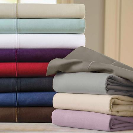
The Green Revolution: Eco-Conscious Materials Win Hearts
Australian consumers are paying closer attention to environmental credentials, and labels made from recyclable or biodegradable materials are no longer nice-to-haves. They’re expectations, full stop. The ability to order smaller quantities through online platforms where you upload your own artwork and process your own jobs means businesses can test bold new concepts without massive commitments.
Here’s what’s driving the eco-conscious shift:
- Polypropylene labels offer durability and water resistance that paper simply can’t match, making them ideal for products that need to survive refrigeration, outdoor use, or frequent handling.
- FSC-certified paper provides the natural feel brands want with environmental accountability, working perfectly for products marketed as organic, natural, or artisan.
- Textured materials like linen finishes create a premium tactile experience that suggests handcrafted quality and adds dimension beyond visual design alone.
- Sustainable packaging choices align with brand values and appeal to environmentally aware customers who vote with their wallets.
Typography Trends That Actually Matter
Hand-Drawn and Custom Fonts: There’s a noticeable move away from standard fonts towards custom or hand-drawn typography that gives labels a distinctive personality. This works across both minimalist and maximalist approaches, adding a human touch that feels authentic rather than corporate or mass-produced. Generic fonts are so 2020.
Unexpected Font Pairings: Designers are getting braver with mixing serif and sans-serif fonts, or pairing elegant scripts with bold block letters. When done well, these combinations create visual interest and help different types of information stand out naturally, guiding the reader’s eye exactly where you want it to go.
See also: Expert Tips for Long-Lasting Roof Repairs in Central Coast
Colour Psychology Isn’t Just Marketing Fluff
Strategic Palette Selection: Colour choices aren’t random, even if they look spontaneous. Successful brands are using colour psychology deliberately to trigger specific emotional responses. Earth tones suggest natural and wholesome, bright neons scream energy and innovation, and deep jewel tones communicate luxury and exclusivity. Your colour palette is working on consumers before they’ve even processed what your product actually is.
Standing Out in Saturated Markets: In categories where competition is fierce, some brands are deliberately choosing colours that don’t match category norms. A bright yellow beer label in a sea of dark greens and browns gets noticed. It’s risky, but sometimes that’s exactly what you need to break through the noise.
Pretty Labels Mean Nothing If They Fall Apart
Staying current with design trends means nothing if your labels can’t deliver on durability and functionality. Products that sit in fridges need water-resistant materials. Items exposed to sunlight require fade-resistant inks. The most beautifully designed label in the world is worthless if it peels, smudges, or deteriorates before reaching the customer.
Professional printing services understand these technical requirements and can guide you towards materials and finishes that match both your aesthetic vision and practical needs. You get expert-level print quality whilst maintaining creative control, delivering the best of both worlds without compromise.
Time to Stop Playing It Safe
Design trends offer inspiration, but your labels need to work specifically for your brand, your products, and your customers. Whether you’re drawn to minimalist elegance or maximalist energy, the key is choosing an approach that feels authentic to what you’re selling and who you’re selling it to.
If your current labels aren’t capturing attention or your brand identity feels dated, it might be time for a refresh. Request a quote today and see how modern label solutions can transform your product presentation.